 Water and stone form one of the starkest contrast in nature. I love this contrast because water is just an element that brings peace to those who are around it. Stone has this ancient quality, even when it is being recreated by people, that gives this timeless type of presence. In a way, this is going to be one of my themes I am looking for in my new work - peace and timelessness. The elements of nature, and of forests, speak this to those who try to experience it. To be able to capture the fluidity and strength of water, while portraying the historical presence of stone, that is what I would strive to do to help a view understand what it means to be in a city-scape where nature and cities and co-exist and work towards a green and sustainable environment.
 Saturday, July 30, 2011
Water and Stone
Water and stone form one of the starkest contrast in nature. I love this contrast because water is just an element that brings peace to those who are around it. Stone has this ancient quality, even when it is being recreated by people, that gives this timeless type of presence. In a way, this is going to be one of my themes I am looking for in my new work - peace and timelessness. The elements of nature, and of forests, speak this to those who try to experience it. To be able to capture the fluidity and strength of water, while portraying the historical presence of stone, that is what I would strive to do to help a view understand what it means to be in a city-scape where nature and cities and co-exist and work towards a green and sustainable environment. Urban Forest - A thought process on Nature vs. City
This slide show is a visual thought process on a theme that is close to what I am already working on for my current series. However, since it is a theme for an upcoming juried exhibition, I decided to go (with Gina) on a photo exhibition into San Francisco to get ideas and see what I could find that reminded me of what an "Urban Forest" might look like. The very thought is a contradiction unto itself. A forest, which is an ecosystem created by nature, usually evokes visions of green trees, plant life, some animals, sources of water, and very few people. However, something urban is born of a city and usually can be found a variety of presentations, all quite often appearing artificial and separate from anything natural. However, what I find fascinating, as I explore this subject, is the varying degrees of efforts used to blend the city scape with a nature scape that calls to mind images of a forest, or aspects of a forest at least. It creates a unique contrast of organic and human-made objects that often bring either peace or good feelings to people. One thing you can notice, at least from my view, is that when a city incorporates more natural forms and objects into the city-scape, people gravitate more to that than if it were simply concrete, steel, and glass. In these photos of the slide show, the forms and contrast are more of the focus than the interaction with people, but it is an unmistakeable attraction of people when the soft forms of trees, flowers, and shrubs contrast the hard edges of buildings, bridges, and streets. I particularly like the contrast of the sculptural founntain in Embarcadero Plaza, because the fluidity of the flowing water created such a stark contrast to the hard, geometric forms created to funnel the water through the fountain system. Flowing water is the center of a thriving ecosystem for a forest. Trees and plans need water, just as people. It was unmistakeable how popular the flowing water was...and the hard stone, while in the form of some very un-natural geomtric shapes were layered with some very familiar earth and stone textures to call to mind rocks that are often found with flowing water. All of this, in short, is just the beginning of a thought process of where I will go with this new work. I hope people like the slide show, and, always, please feel free to comment.
-Jesse
Thursday, July 28, 2011
Sphere of Influence
 This is a third one in the trading card series. I call this one "Sphere of Influence". While this one is not the first one created in the series, it could be title piece of the series. I am interested and fascinated with the ideas of spheres of influence. As we look around at nature, we see everything inteconnected. There is no way around it. It is the bottom line. What we do in one place will affect someone or something somwhere else. As I write this, there is a devastating drought on the Horn of Africa. I have friends there right now, as we speak, who are dealing with this. If you look at the spheres in my picture, they are interwoven into the primary image, to the point where they are transparent, but extremely obvious. The patterns I use within each sphere are used to work with the natural composition and design of the primary image, yet the sperhes have a pattern all their own. These patterns remind me of certain things. The jagged lines of one remind me of fractures. These fractures are occurring everywhere as we continually persist with agendas without regard to the consequences. There is a sphere with horizontal blocks, that remind me of sky scrapers put on their sides, but with an organic feel to them. This takes me to a human-made sphere, one where the influence is created by humans. The third sphere is one that is wrapped by organic shapes...maybe leaves, maybe something else, but it is one that is natural in feeling to me. Notice how this one blends the most with the background image. It should be our goal to leave as little foot print as possible and work with our environment. If we look at the world and life, we should view it in layers...I truly try to achieve a feeling of layers with this image. In my others ones, not so much - part of that is a limitation of the colored pens...but then I let the colors speak more, and put away the layers for another time with those images. However, even with those, There is a certain amout of interconnectedness represented in the color drawings. I draw upon the subconscious to guide me and allow myself to respond as each part of the the drawing unfolds, so it is spontaneous...only following a feeling, not trying to drive the feeling before me. I simply talk about my thought process here as it unfolds in my work. Thanks for viewing.
Jesse

A New Image in the Trading Card Series
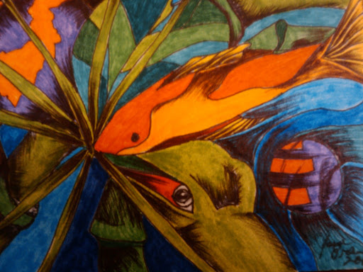 This is a new one in my trading card series. It is untitled as of this moment, but I wanted to share with everyone to see if I can get some feedback. I like this one a lot for several reasons. I have gone in a different direction, using the imagery of a fish and a lizard as a focal point, and incorporating the pattern of a tortoise shell into the background. I am still working in pen and ink...I am set on completing this series of 20. I want to be able to put them all in a row and get a feel for what they say, and then determine where to go from there...think about what I may want to do next, ask what else needs to be said, and then approach my next series with the idea if I should push farther with what I am doing, use only part of what I am doing, see if I need to switch mediums, evaluate that size of each work and see if I need to go bigger, recombine, or alter the approach and use a different format...the possibilities could be endless...but the bottom line is that I am working through this series and trying to figure out what I want to say as I go...and see what the series as a whole says as well. I hope people like it, and leave comments if you can. Thanks.
Jesse
Wednesday, July 27, 2011
Trading Card Series

This is a new piece that I have done as part of a series. This is a very small piece, approximately 2.5 x 3.5 inches. I am working in a series exploring ideas related to the environment and nature. I don't have a specific idea going into a picture like this, I simply create an image and respond not only to the flow of ideas, but to the aesthetics of the picture as it unfolds as well. I am concerned as much with the push and pull, as well as the flattening of space, as I am with the images I use. What I have discovered over time is that color really grabhs people's attention, not to mention the fact that nature is full of incredible colors everywhere. I do not strive for realiztic color, but exaggerate color use it as an emotional response. Quite obviously, this image is not a realistic representation, but an emotional and subconscious representation and reaction to a thought process that is constantly revolving around states of nature, things I have seen, and experiences I have grown up with. I like the contrast of the black ink against the bright colors and what it can do for the image. I look forward to your responses. As a final note here, I have yet to name this piece...it is complete, but I have no title. I am not even sure if I will give it one. Thanks for stopping in.
-Jesse
Kenpo Slide Show
This slide show is a small movie of some of the moves and environment in which I train in when I go to Chico. I train at Epperson Bros. Kenpo Karate Dojo...it is a great place to train and learn and Nathan and I have spent a lot of hours training there and learning the rules and principles of Kenpo there.
Another reason for this post is I am working with a new format for the blog and really would like some feedback on how it looks and what people think of it, so if you come by and take a look at the blog...please leave me a comment or two. Also, if you really think it's cool, can you share it via the facebook and twitter links towards the bottom. I have some links in the side to speed up the navigation of the blog and you can search for some key words also in the top right of the page.
Please enjoy the slide show.
Jesse
Thursday, July 14, 2011
The Way of the Warrior - Timing and Distance

So, what is this business about timing and distance? It is not a very dynamic title, I am sure. However, this is yet another critical point of understanding if one is going to be effective in martial arts. Timing and distance dictates the ranges from which you fight. Notice that I am in very close using an elbow with Nathan. Elbows are not for the feint of heart, to be sure. You are in close quarter combat and looking to finish the whole situation. But, even more so, it fits the context of the situation. The short range weapon fits the position and allows for the combatant to maneuver. Also, notice how my hand is opposing my elbow, this gives a certain amount of borrowed force because the pushing coming from my hand creates an opposing force to the elbow - therefore the strike borrows additional force in that way.
There are other zones of operation, as I call them, that affect weapon choice, etc. There is kicking range, punching range, and grappling range, which is even closer than the elbow range here. These are all important concepts to consider when executing Kenpo, or whatever art you practice. Hope you guys like it...talk to you soon!
Jesse
Tuesday, July 12, 2011
Echoes of Spartan History

Echoes of Spartan History is a piece I created in graduate school I would classify this more as a study than a finished piece of art. I was exploring the image and ideal of Sparta and Spartans as I studied them in graduate school. The combination of watercolor and graphite is one of my favorite methods of working in art. There are a variety of things that you can do with this style and I like layered and ethereal effect I can get when I combine the two mediums. I have always been fascinated with the layering of ideas and images in this way. It is my goal to see how much I can blur the lines between ideas and images. I feel that there is a great deal to learn still using this style.
As for Greece and the Greek theme of history, it is something that continues to fascinate me. I really am not going for traditional looks or ideas here. That is something my mother taught me. I would not call myself a traditional drawer, watercolorist, or printmaker. I do what it takes to get the image and idea thazt I want and achieve the feel that I want in the piece that I am creating. While I can appreciate that prototypical photo of a white piece of architecture against the azure waters of the Mediterranean in the Greek isles, that is not what I am going to recreate with my pieces. I seek something a little less traditional and, I believe, a little more complex. I will post more as I go.
Enjoy the piece and email me or leave comments and questions.
Jesse
Sunday, July 10, 2011
The Way of the Warrior - Kenpo self defense, Destructive Twins

This particular photo shows a variation on the ending of Destructive Twins...now this is probably not a very familiar idea to anyone who has not studied Kenpo previously. However, let me share some thoughts on this image, photo, and technique. This particular image of me drilling Nathan with a back-kick to his stomach is the finishing move that is taught at the end of a Kenpo Technique called Destructive Twins. If you notice where I have Nathan's hand and arm, I have it up in a modified wrist lock to expose his ribs. This lock not only exposes his ribs by clearing his arm out of the way, but it also forces his head below his waist. In doing this his height zone is cancelled, preventing him from standing up and using any back up weapons to counter my technique. In Kenpo, what seems obvious often disguises much more subtle ideas and concepts. What looks like a simple back kick blasting my friend illustrates a variety of concepts and principles within the Kenpo system. Another idea that is illustrated is the idea of back-up mass. This is the idea that when your body weight moves in line with your weapon, then you add power to that weapon. I am not trying to complicate ideas and issues here as I write. What I am trying to do is to share ideas so that nearly anyone can understand them, even if they do not train in the system of Kenpo. I also hope to share the art that I have found interesting for about 20 years. I will try to publish exciting photos that are fun to see and interesting to read about. I will continue to post one to two concepts every few days or so, so there can be an active and consistent chronicle of how Kenpo works. If you have questions or comments, please feel free to write them here. I will respond as soon as I can if you have anything to ask.
Thanks for stopping by!
Jesse
Saturday, July 9, 2011
Way of the Warrior - The Kenpo "Inside Rule"

Well, I would imagine a photo like this would catch people's attention if they see it. What is the "Inside Rule"? It is an essential principle within the art of Kenpo Karate. It applies to a variety of positions, particularly when two oppoents face each other, face-to-face, and you find yourself on the "inside" of your opponents' loaded weapons. Essentially, the inside rule is about breaking down the height zone and cancelling any possible loaded weapons (natural weapons like a poised punch or kick) so you do not have to deal with them. If you notice, Nathan here got me in the eyes and about belt level with a kick. This simulatneous striking of multiple zones multiplies potential damage while taking away my solid base to stand on. Kenpo is a lot of things, and this is just one of many, many ideas that help hold up Kenpo motion. Nathan and I train these principles when we get together, and it just takes practice in executing and understanding them. I chose to talk about the 'inside rule' with this photo today. There are more ideas and things that could be talked about, but I am going to leave it at that for now. Please feel free to comment or ask questions.
Enjoy the photo and the information.
Jesse
Friday, July 8, 2011
Training of an artist and warrior
I was talking with a friend of mine this morning, and we were discussing, in part, the intuitiveness of art and martial arts. This led me to think about what does it mean to work intuitively. What does that say in and of itself? I know that is how both my mother and I work in our art. I was taught to work from intuition. I have found that my best work comes from what I "feel". I think my friend and I would agree that the best martial arts practice comes from what you "feel" is right in a given situation. There is no time to think. Thinking can lead us to question things in the wrong places. There is a place for thinking things through, of course. But, to operate on intuition is the goal of every warrior and artist, in my opinion. Yet another place where art and martial arts cross paths. Something to think about.
Jesse
Jesse
Thursday, July 7, 2011
Olympian Legacy

What I found out is that there is an incredible treasure trove of ideas and techniques that can be used and adapted from art history. It is not necessary to really limit yourself to modern or contemporary for the sake of trying to feel modern - you can take ideas and reuse them in a modern way to help give things a fresh feel.
I enjoy working with flat images and shapes, while introducing a slightly graded shape or field of color to help contrast the main image. One idea can lead to another, and I find myself, as I work through making this blog and looking at older work, coming up with new ideas and wanting to try new things.
What I found, after I got out of school and began teaching, I needed some time away from art to gain some perspective (and to just earn a living). I look at this series of prints in an entirely new light, which is entirely valuable to me now.
I hope you enjoy this entry and look forward to any comments.
Jesse
Wednesday, July 6, 2011
Hurculean Legacy
As I write this, I contemplate the differences between my mother's art and mine. I just posted her first piece. I look at this print, and think back to what I did for grad school. This was a time when I was doing multiple colored linoleum blocks in grad school in relation to my research of the Hurculean legacy of the Spartans prior to the Battle of Thermopylae. As one can tell, I was fascinated with the legacies of warriors even back then. If you look at the imagery, it shows a young Herakles (Greek spelling) wearing a lion skin and the Corinthian helmet in the background. I also became increasingly fascinated with the black figure style of vase painting from ancient Greece.
This calls to mind many things and many ideas that I would like to explore this summer. Of course, as is the trouble when one has too many thoughts, it becomes a challenge to contain them and focus. I will continue to post more work and offer some more commentary on the work that I post. Look here and on the other blog - http://artofeb.blogspot.com/ - for additional thoughts and work. I will be creating some new work as well, with - I hope - a fresher and more contemporary look that is more representative of this time period for me. In the mean time, if anyone has comments and or inquiries, leave me a message or send me an email. Enjoy:-)
![]() Jesse
Jesse
This calls to mind many things and many ideas that I would like to explore this summer. Of course, as is the trouble when one has too many thoughts, it becomes a challenge to contain them and focus. I will continue to post more work and offer some more commentary on the work that I post. Look here and on the other blog - http://artofeb.blogspot.com/ - for additional thoughts and work. I will be creating some new work as well, with - I hope - a fresher and more contemporary look that is more representative of this time period for me. In the mean time, if anyone has comments and or inquiries, leave me a message or send me an email. Enjoy:-)

Sunday, July 3, 2011
Reflections on Art
As I take the time this weekend to start addrressing artistic ideas and settings, I thought I would post some thoughts on art overall. We have just moved to a new place, and so we are considering what will go up on our walls. This has motivated me to reflect about what does it mean to put something up on a wall in your home?
I think, for me, it is extremely personal what goes up on the wall. I understand that people say, "Of course it's personal, it is art in your home." However, I would argue that it goes further than that. It is not something that you politely share with guests, or just to match color schemes in your house that match your personality. Art is about communication with your heart and soul, so therefore it is intensely personal in multiple ways, more so than most of us know.
If you look around, you see a lot of work passed off and sold in home decoration stores for that pleasing color match or design element and/or factor. If people are interested in that, that is good, but I feel it takes the uniqueness and personal feel out of the expression of your space. I know I have discussed this with my wife, Gina, that art is important and what goes on our walls has to be of a specific mind and quality, and that changes from person to person.
We live in an age and time where the art of advertising and graphic design dominate the public market. Take for example posters of comic book art and video game art...mass produced posters and prints say something to each viewer, just like an original picasso says something to the viewer. Which one is better? Well, of course, most people would probably say the Picasso, but I would also argue that every piece has its value, especially when it is chosen to hang on the wall in a person's house. It is a reflection of that person's personality. Therefore, I would say that since we vaule people, we should value the choices that they make in art, whether it is graphic art or fine art.
For me, however, since we have generations of artists in our family, it is important to hang art that is unique and hand crafted...because that is the tradition from which we come in our family. That is part of the choice that I make...that we make. even within the art that we choose, whether or not it is from my portfolio, a family member's portfolio, or someone else's, the images, colors, ideas, etc. are very important because they all reflect what we want to say and feel as we walk into our space.
Art is important because it affects the space we live in and how we think and feel. Art is a reflection of our life and time...so I believe the choices that we make with regard to art are significant ones. Have we decided what to put on our walls..Yes and no...we have general ideas, but I think we are still trying to figure out what we want to say when we hang those pieces up...I would encourage others to think about what they hang up as well, because I believe it to be an important choice for every household.
Just some thoughts for the day. I will post more work soon.
Thanks for reading!
Jesse
Subscribe to:
Posts (Atom)